top of page

MeLove Travel
In-depth travel experience with quality.
With personalized and customized service with quality, we tailor-make your dreamed travel.
Ver2.0
MY ROLE
Redesign melove. The project was discussed and produced by me and the PM.
・Persona
・SiteMap
・Wireframe
・Style Guideline
・Mockup
Due to confidentiality purpose, only parts of the information are listed.

THE PROBLEM
Before the revisal, the website did not link with TripMoment, so the relevance between the two are not obvious, so we cannot direct TripMoment’s fans to Melove Travel.
THE GOAL
Enhancing the link with TripMoment.
Clear display of itinerary.
Project Process
1.Persona
After discussing with travel agency and PM, I drew the user journey map of Melove Travel, analyzed user behaviors, and produced persona and user interview.

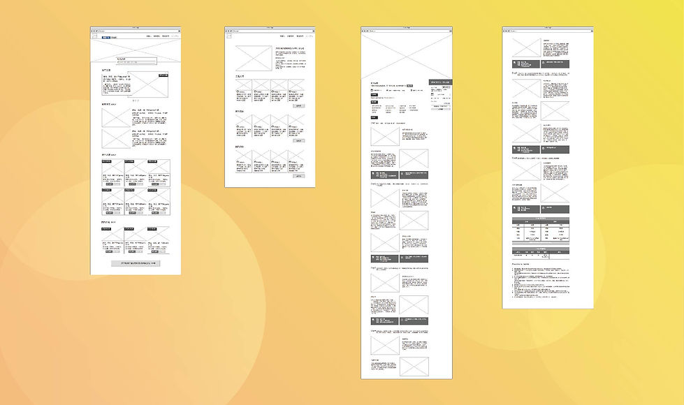
2.Making a sketch
I made SiteMap to confirm what pages do we need also drew drafts of the pages in Balsamiq
3.Style Guideline
Draw in Sketch,Including color planning, Button and Icon, Text Style.

4.Mockup
After confirming the sketch, draw the Mockup in Sketch.

THE FEEDBACK &
WHAT I LEARNED
・During the interview, listening and asking the right questions are of great importance, as I cannot lead the topic too much and nor can I let the interviewees to just talk about whatever they want. Since our company focuses on tour groups, I encounter some people that I used to not knowing much as my TA (eg. Dads with kids), and I got many unexpected feedbacks during the interview.
・We discussed a lot on how to link with TripMoment, and finally we decided to put the link in “About Us”, as we first introduce the relevance between Melove Travel and TripMoment, and then we display articles related to itinerary, as this creates a friendlier user experience than putting the link on the homepage.
bottom of page